For those who are just breaking into the world of menswear, assembling outfits that are harmonious can seem to be a daunting challenge. After all, if you just throw a bunch of garments together with abandon and they feature all kinds of different colors, the end result might be that you end up looking like a clown.
The first step to preventing this outcome then is to start by assembling a base wardrobe of solid and conservative colors. Namely things in the grayscale, shades of brown, and shades of blue. Regarding the grayscale, gray and white are far more versatile than solid black actually is.
After assembling this base wardrobe, some men will then be tempted to try experimenting with different bolder colors and this doesn’t have to be a challenge.

Understanding The Color Wheel
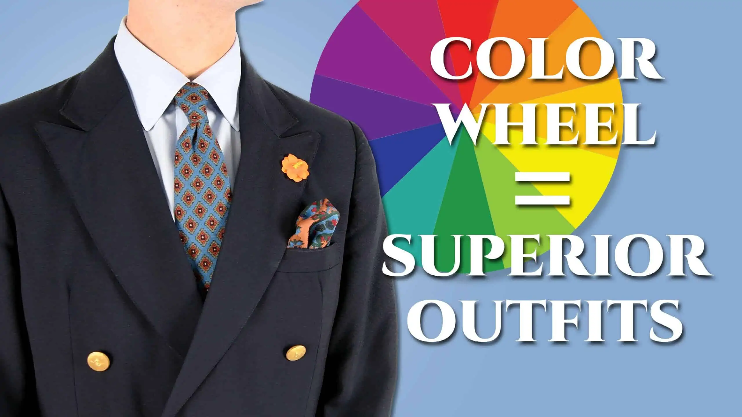
First pioneered by Sir Isaac Newton around 1665 to show the colors refracted from a beam of light, the concept of putting the colors of the rainbow in a circular orientation was soon applied to pigments as well thus, the modern color wheel was born.
Primary Colors
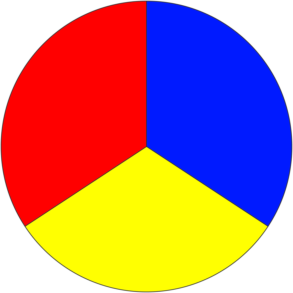
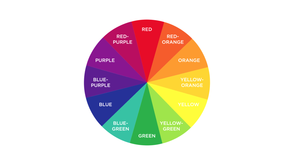
The world of menswear mainly concerns itself with the color wheel used in the visual arts. As such, three colors we consider to be primary are red, yellow, and blue. What is a primary color then? Simply stated, primary colors are the foundational colors from which all other colors are mixed. In other words, you don’t mix any colors to get red, yellow, or blue, they simply are what they are.
Secondary Colors
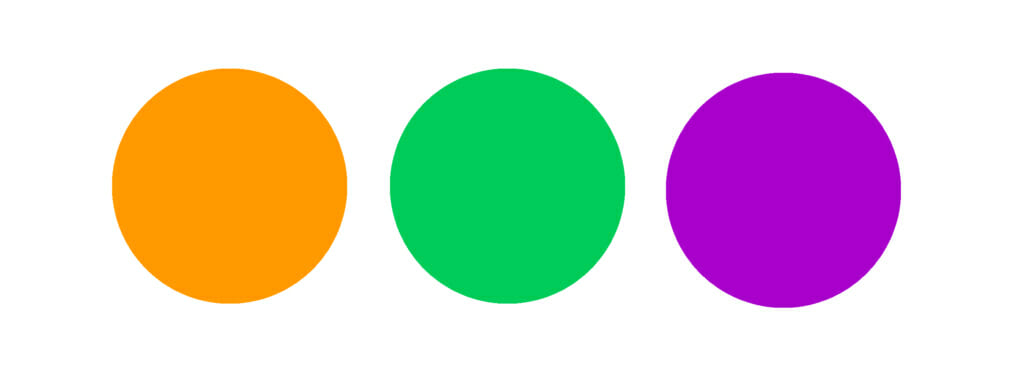
Purple, also called violet, green, and orange. The secondary colors are made by mixing two primary colors together. For example, red and yellow combined to make orange. Referring again to the diagram of the color wheel, you can see that each secondary color is located directly in between the two primary colors that make it up.
Tertiary Colors
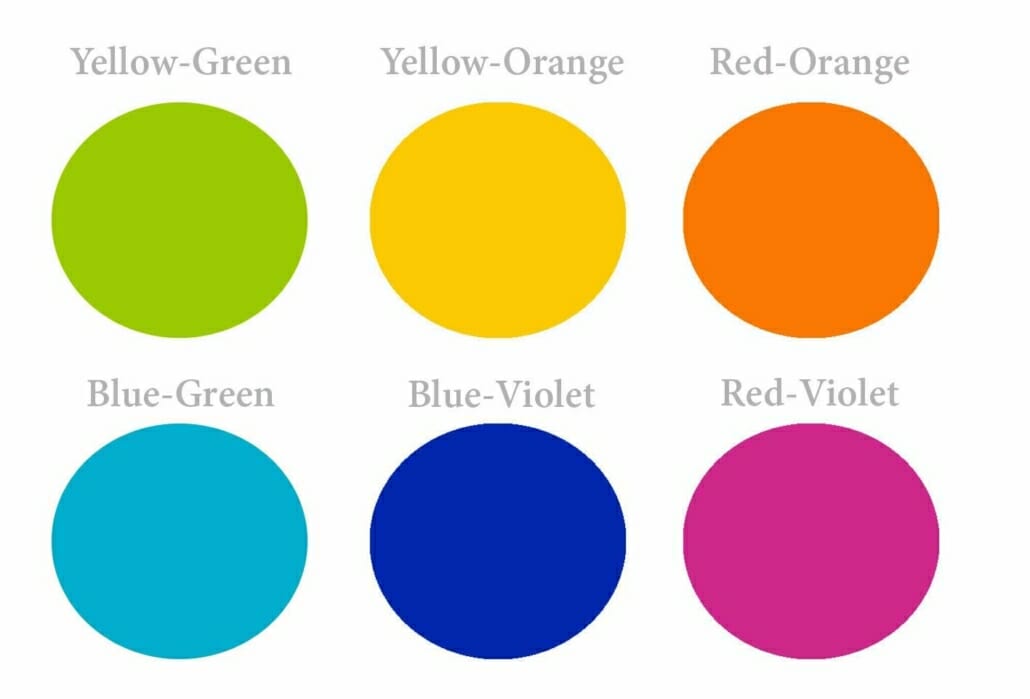
They’re made by mixing a primary color and a secondary color together. These colors can sometimes be referred to by their own unique names, for example, the combination of blue and green can sometimes be called teal but in more simple terms, they can also be referred to by simply combining the names of the colors that create them with the primary color coming first.
Color Temperature
This refers to the perceived warmth of a color. Of the three primary colors, red and yellow are said to be warm whereas blue is considered cool. It follows then that any combination of red and yellow will also, by default, be a warm color. Meanwhile, when cool blue mixes with one of the warm primaries, different things result. While green is usually said to be a cool color, purple is often said to be a warm color. Even so, the relative temperatures of these secondary and intermediate colors can vary. For example, while green is collectively considered to be cool, a yellow-green will still be warmer than a Blue-green.
Color Intensity
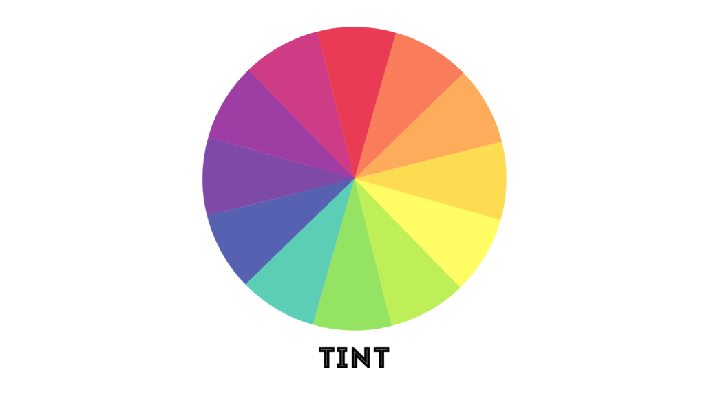
Another important concept to understand is that of color intensity or the lightness or darkness of a color. Another word for color is hue and that’s usually the word used when we’re talking about the relative lightness or intensity of a color. If white is added to any color, this is referred to as a tint of that color. The result is a lighter and less intense hue. Conversely, if black is added to any color, this results in a shade, sometimes also called a tone of that color. The result is darker and also less intense. For the highest intensity possible in a given color, just go with the default true hue.
Speaking of black and white, they’re not considered colors in the strictest sense since they’re not on the color wheel rather they reside on their own spectrum which we refer to as the grayscale since when black and white are mixed together in varying quantities, they result in different shades of gray.
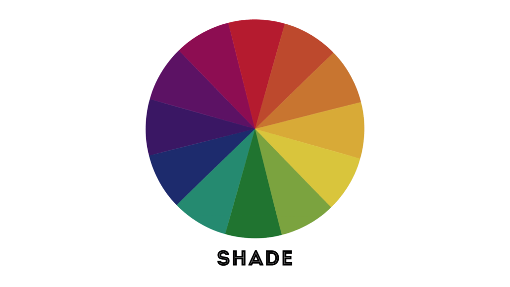
It’s also sometimes said that you can achieve black by mixing together all of the colors on the color wheel though this is really more of an approximation.
You may also have noticed that brown isn’t anywhere to be found on the color wheel, this is because in order to create a brown tone, certain colors have to be mixed together.
Color Relationships
In addition to the colors on the wheel relating to each other in terms of how they mix together, they also have relationships in terms of how they interact when they’re kept separate. If that’s a little hard to understand, just keep your eye on the color wheel for these next few terms and everything should come together.
Analogous Colors
Simply put, analogous colors are ones that are similar in temperature and are found close to each other and sometimes directly adjacent on the color wheel. Any color analogous to a primary color is a color that features that primary. So for example, everything from yellow-orange to red-orange is analogous to yellow because all of those colors feature some amount of yellow in them.
Complementary Colors
The other important color relationship is that of complementary colors. In simplest terms, any two colors that are directly across from one another on the color wheel are considered complementary. Because of this distance apart from one another on the color wheel, complementary colors have the highest amount of contrast possible. Some examples of complementary colors include red and green, yellow and purple, and blue and orange.
Split Complementary Colors
In addition, the designation of split complementary colors can be applied to any one color and the two direct analogs of that color’s complement. To state that more simply with an example from the color wheel, red-purple and blue-purple are these split complementaries of yellow.
So answering our question about how to get brown then, the simplest way to achieve a brown tone is to mix complementary or split complementary colors together. Simple, right? There’s a complete overview of the color wheelout of the way.
Why Do We Need To Understand Color Relationships When Putting Together Outfits?
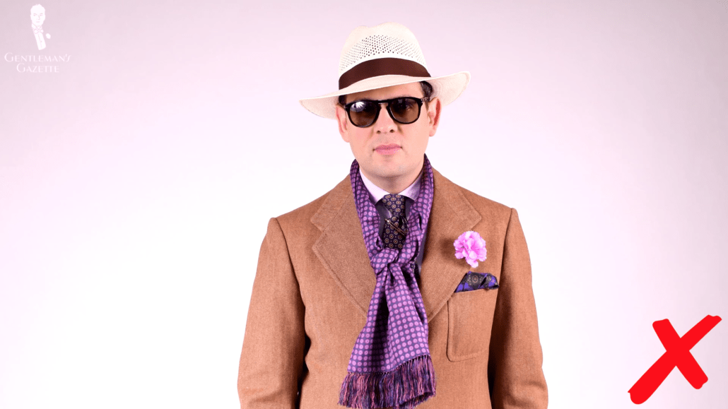
The answer is because color is the principal way that we can direct the eyes of others. The primary objective of any colors in an outfit should be directing the eyes of the viewer to your face and also making your face look as well colored and healthy as possible. What’s the best way of going about doing that?
In short, there are two main methods for achieving this effect with your outfits:
- The first of these techniques is to match the degree of contrast between the colors in your outfit to the degree of contrast between your skin tone and your hair color. Speaking of which, you can find our video on how to early determine your skin tone here.
- The second technique is to directly repeat or otherwise echo one of your natural colors whether that be your skin tone, hair color, or eye color in the colors of one or more of the garments that make up your outfit.
How To Wear & Pair Colors Effectively
Regarding the degree of contrast between a man’s skin tone and his hair color, men fall into one of three basic groups; high contrast, which is most typically characterized by fair skin and dark hair though the reverse could also be true for darker skinned men with dyed or graying hair, medium contrast where the colors are different but not to a large extent, and low contrast either fair-skinned with blond or graying hair or dark skin with dark hair.
High contrast men can more safely experiment with wearing combinations of bolder colors. For example, pairing primaries or complementary colors together. Just don’t go for the true hues of all of these colors when you’re pairing them together or you will fall into that trap of looking like a clown. Instead, try pairing primaries or complements that have been further augmented with tinting or shading.
A medium contrast man can, of course, wear a garment that is bolder in color but he should be mindful that if he does so, it will draw some attention away from his face. Again as with many things in menswear, confidence is key here.
Low contrast men are the ones who should be most careful in pairing together contrasting colors, really make sure that you’ve muted the hues of the contrasting colors if you decide to wear them as that’s the best way that you’ll be able to pull them off.
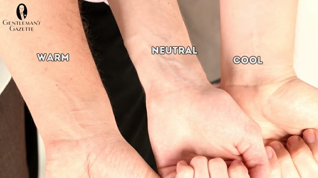
Color Temperature & Intensity
When it comes to having colors in an outfit that echo a man’s natural tones, the keys here are temperature and intensity.
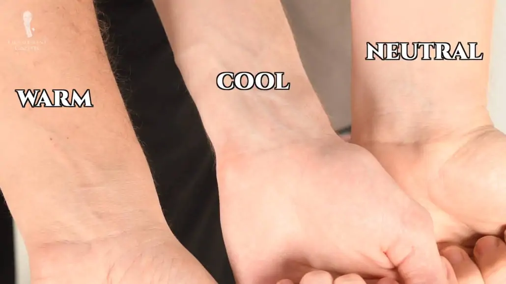
If you have light skin and light hair, stick to wearing pastel shades with colors that echo your undertone. Colors like blue, green, or purple for a cool skin undertone and red, yellow, and orange for a warm undertone. Conversely, dark colors and black will most likely make your skin look washed out and ashen.
The exception here is if you’re a man with light skin and very dark hair, in which case a high contrast man, and then, of course, you can go ahead and wear these darker colors. If you have fair skin and still want to go for a subtle contrast, take the cue from your hair color. The classic example here is that red-haired men typically look very good in pastel blue shirts.
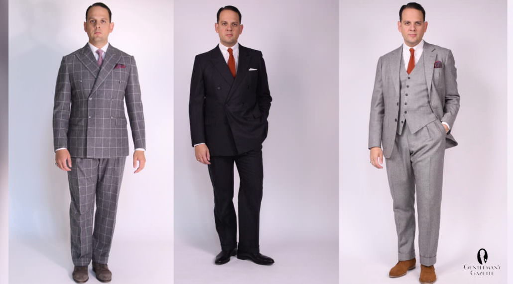
If you have medium skin and hair, you can start to experiment with more true hues. Slight shades or tints of colors without being too extreme in either direction are going to work well for you. You can echo your undertones for a look that’s more harmonious or you can go with the complements of those colors for something that’s a little bit bolder and more fashion-forward.
Finally, if you have dark skin and dark hair, you’re somewhat lucky in being able to wear both true hues and darker shades as your face is really in no danger of looking washed out by these darker colors. The one area to be careful in your position is if you try to wear extremely light tints of colors as the high contrast will still end up distracting from your face. If you want to wear a lighter garment, we suggest that you do so in conjunction with other darker pieces. As with medium toned men, echo your undertones for more harmony and go with their complements for more contrast.
CONCLUSION
Knowledge of the color wheel and the broader discipline of color theory is one of the most helpful and versatile tools in the well-dressed gentleman’s arsenal. With this knowledge, he can be confident that he’s put together harmonious outfits that complement his natural tones and draw proper attention to his face.
What techniques do you use in order to incorporate color into your wardrobe?
Highly informative topic about wearing the right colors when putting together an outfit especially when takinginto consideration your skin tone. Thanks, as always, for the useful tips to help men create a better look for themselves.
It is our pleasure. :)
A good resource for gentlemen to check is “Color for Men”, which guides its readers to determine what seasonal palette is best suited to their complexions. As an example, I am fair with pinkish skin and align to what they have termed a “Winter” palette. I look best in white, black, and bold colors, because the contrast makes me look alive. Pastels, on the other hand, make me look sickly. (The 80s styles were unkind to me as a teen.) The book has sample colors for each of the palettes, making it far easier to find complimentary shades to wear. Women will find a company named “Color Me Beautiful” which provides color consulting.
Here’s a link to the helpful book: https://amzn.to/3eNuoth
Fascinating.
Very nearly didn’t watch this, as I have never had a problem combining multiple coulours. My wife has an uncanny knack for it as well.
Preston, you have hit your pace, sir. A superlative, and splendidly informative video.
Interesting topic! I am an asian from China with black hair and black eyes. I have cool undertone and I get tanned so my skin is a bit darker than most of my friends. Since my skin is not that dark like African people, should I be categorized as medium contrast?
Very Interesting topic, the science between colour perceptions and the effect it has on mood always intrigued me. It makes logical sense that colour combinations are something that should be carefully considered. thank you for the insight.